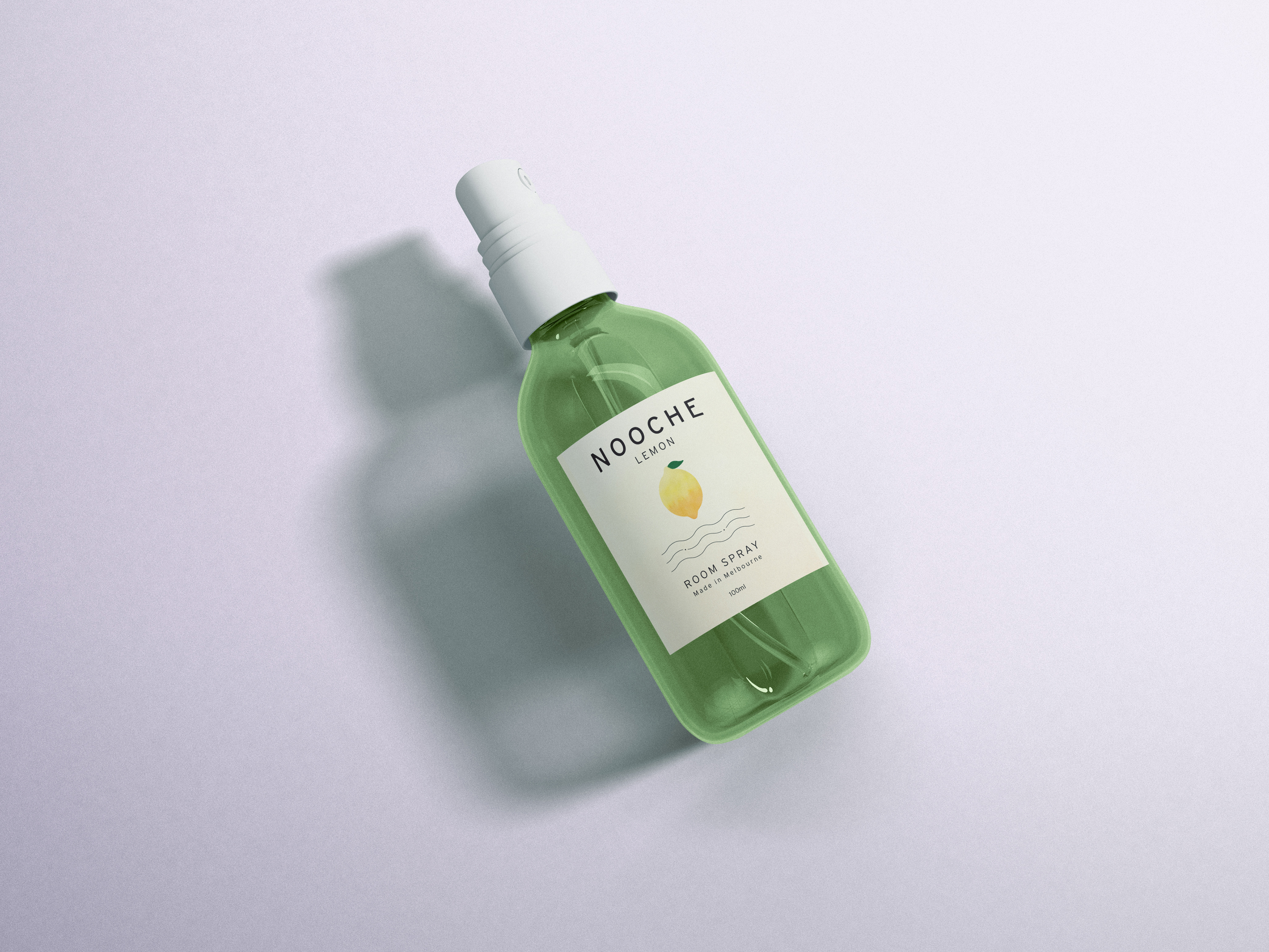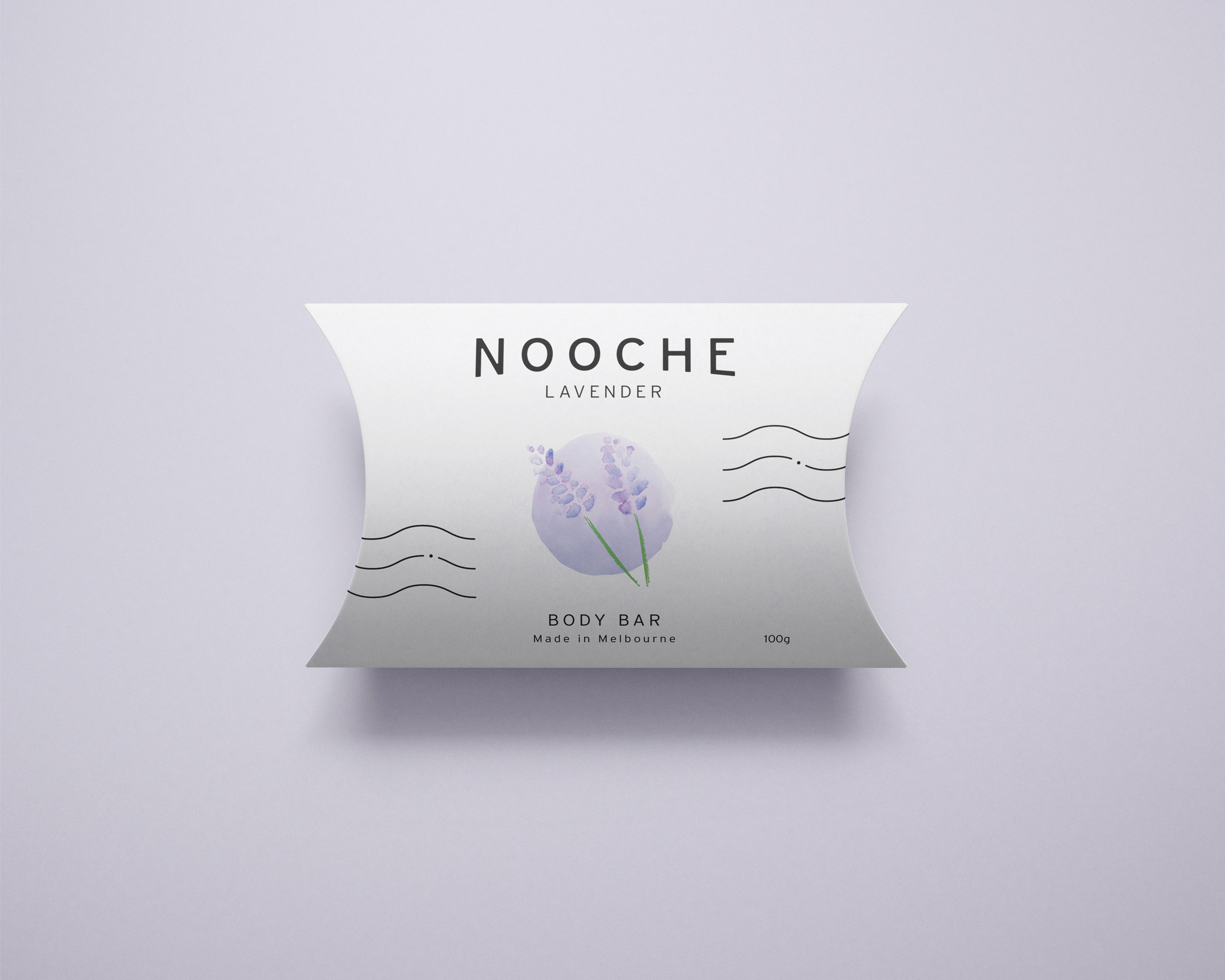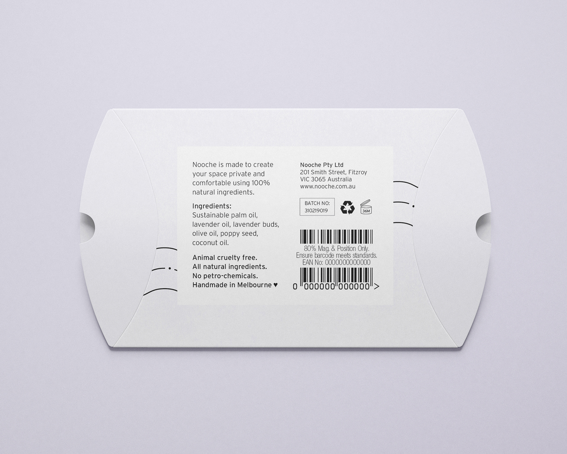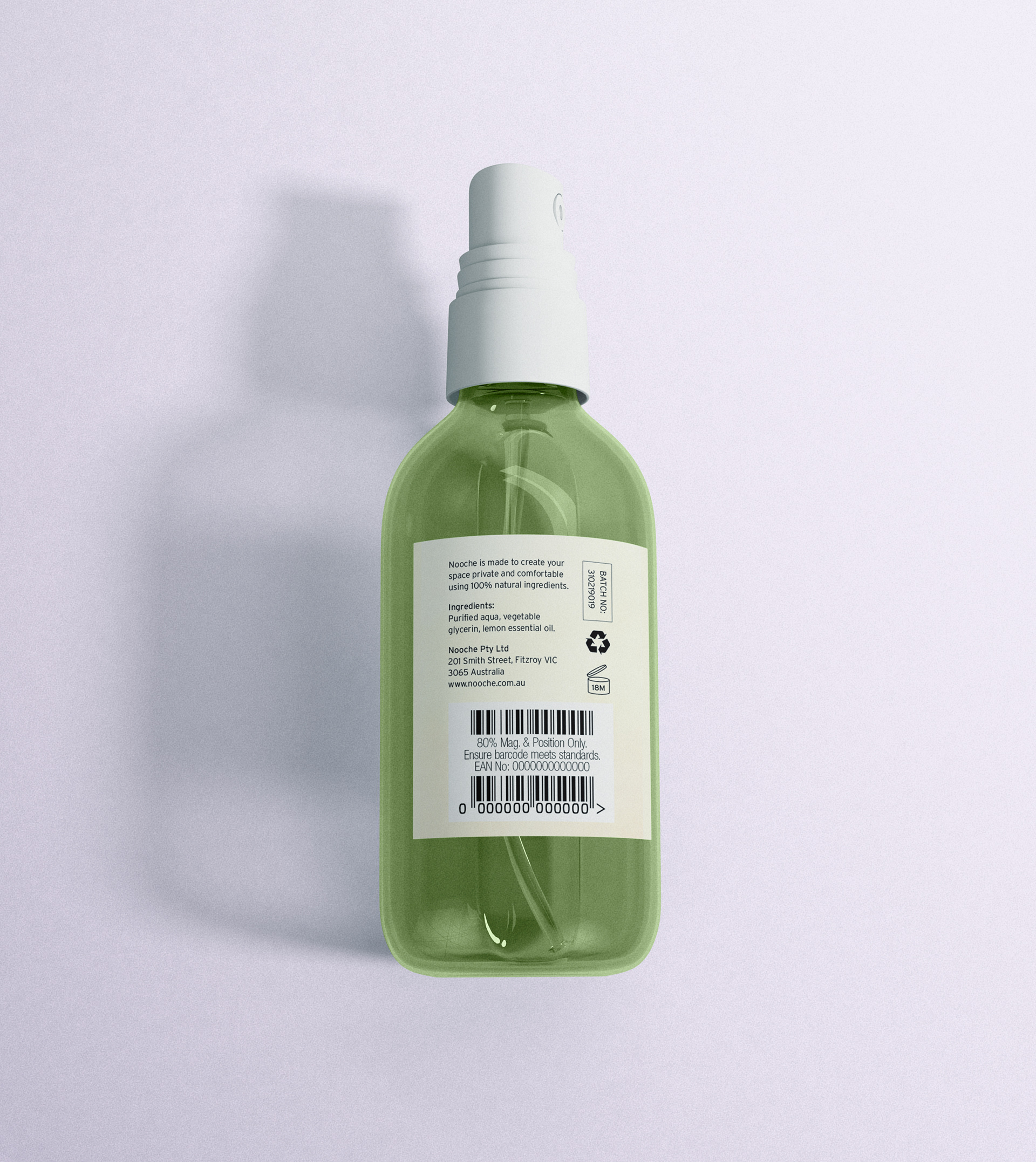

Adhesive label and pillow box packaging designs for a fragrance brand, Nooche.
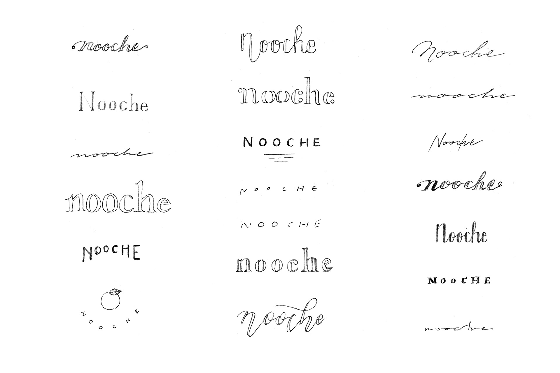
The brand name came from two words; nook and niche. It reflects to the brand concept “Private & Comfortable”.
Nook is a separate and secluded place which represents “private”, and niche is a position that is well suited to the person which represents “comfortable”.
The brand name came from two words; nook and niche. It reflects to the brand concept “Private & Comfortable”.
Nook is a separate and secluded place which represents “private”, and niche is a position that is well suited to the person which represents “comfortable”.
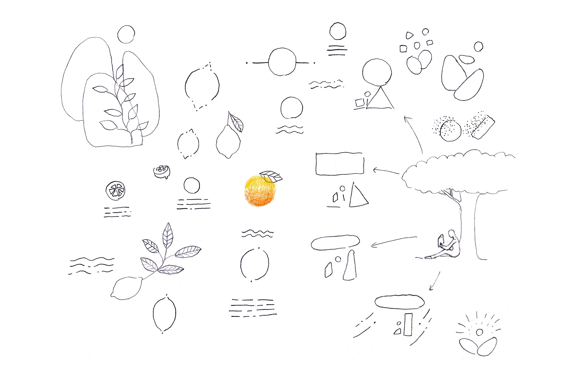
I made gradient in watercolour and scanned it to create organic and refreshing feel to the design. Three wavy lines represent user’s feel – relaxing, comfortable and easing, waves and mountains.
フレグランスブランドNoocheのスプレーボトル用ラベルとソープパッケージのデザインです。
ブランド名はブランドコンセプトである「私だけの心地よさ」から着想を得て、ひとりになれる自然の静かな場所を意味するnookと、ふさわしい場所を意味するnicheの2つの単語を組み合わせて誕生しました。
ブランド名はブランドコンセプトである「私だけの心地よさ」から着想を得て、ひとりになれる自然の静かな場所を意味するnookと、ふさわしい場所を意味するnicheの2つの単語を組み合わせて誕生しました。
水彩のグラデーションで有機的なみずみずしさを表現しています。3つの波線は落ち着き、心地よさ、安らぎといったユーザーの感覚、波、山を表しています。
Client: Nooche
Classification: Brand Identity, Packaging, illustration
Target: Female, 20–40's
Media: Watercolour, Illustrator, Photoshop