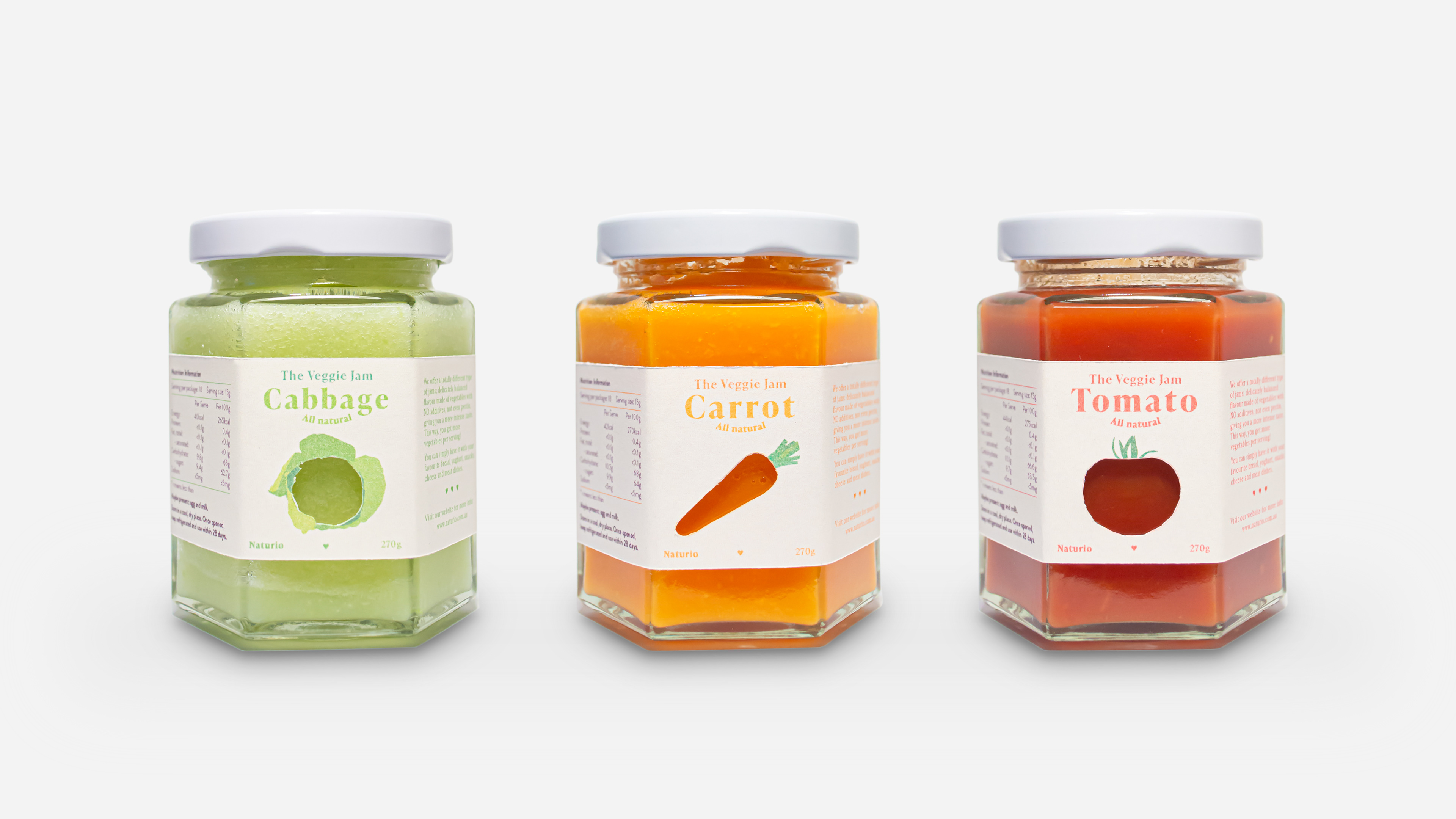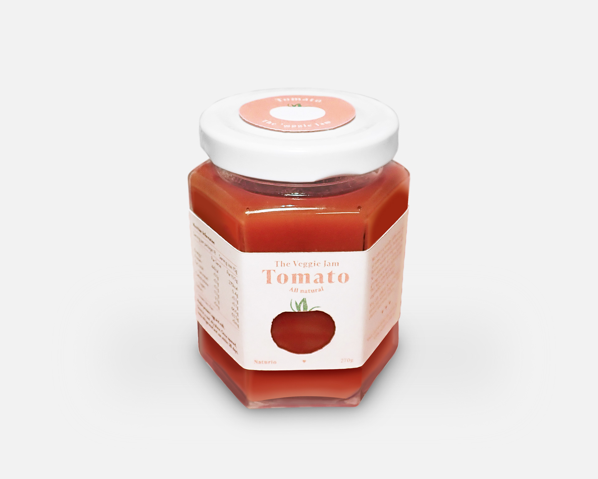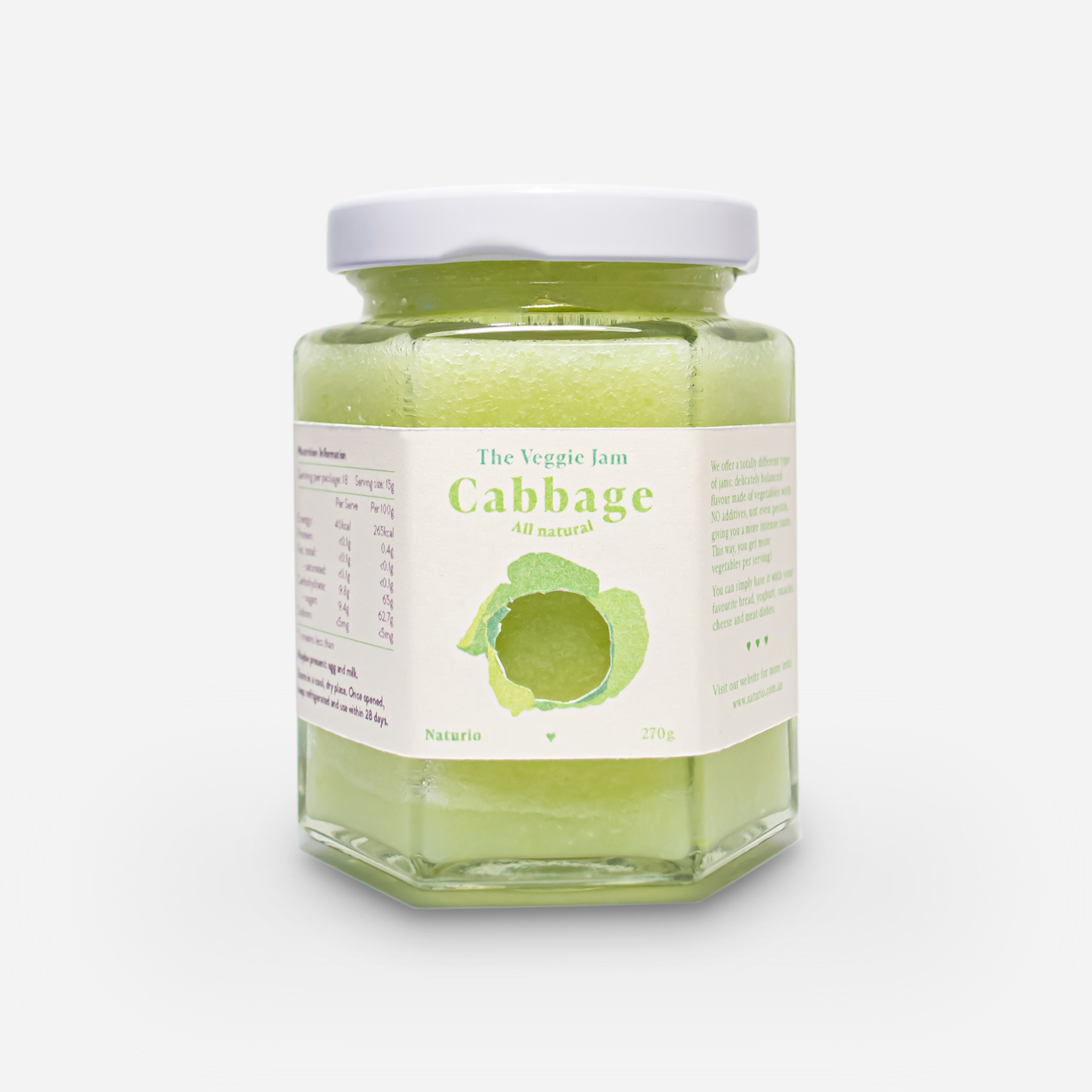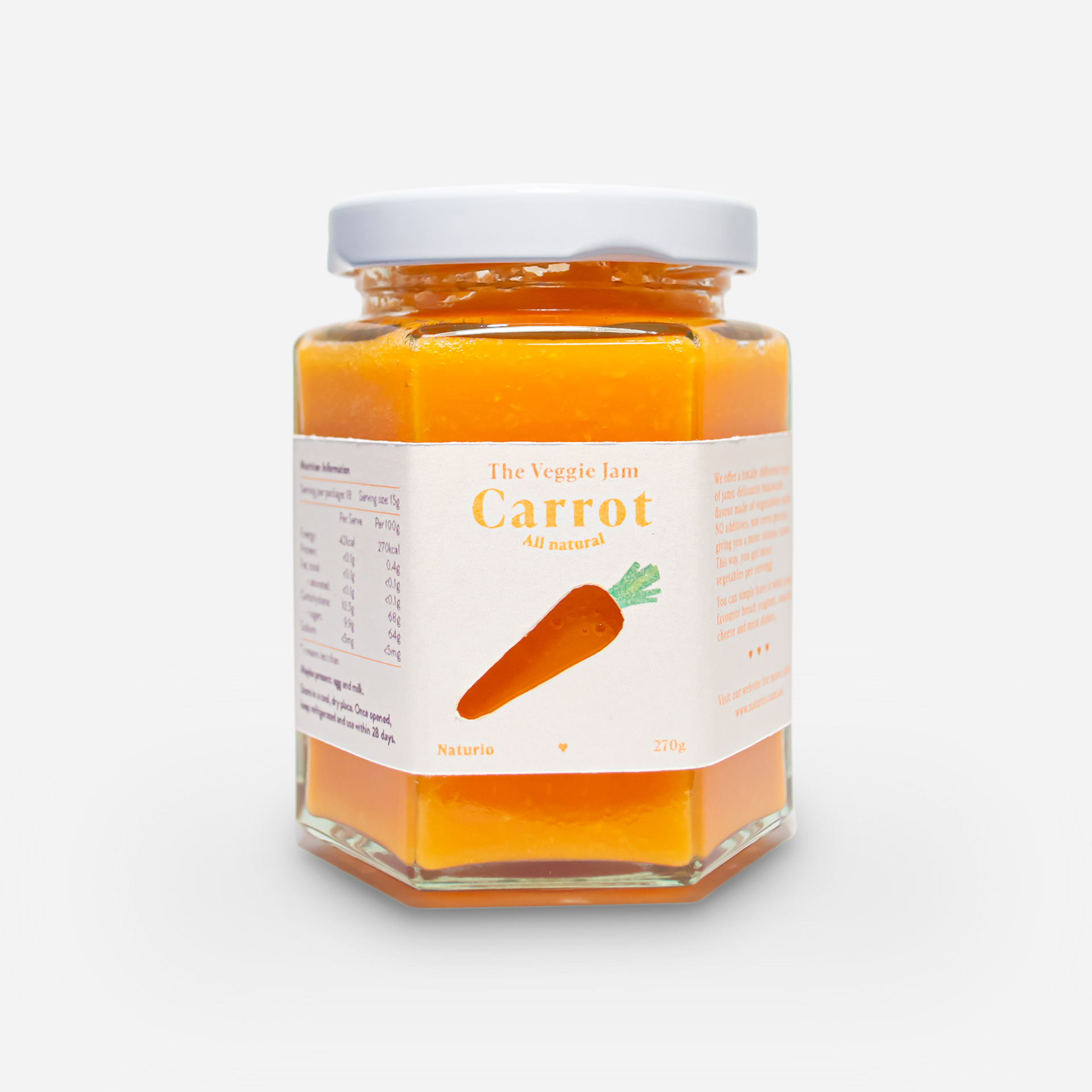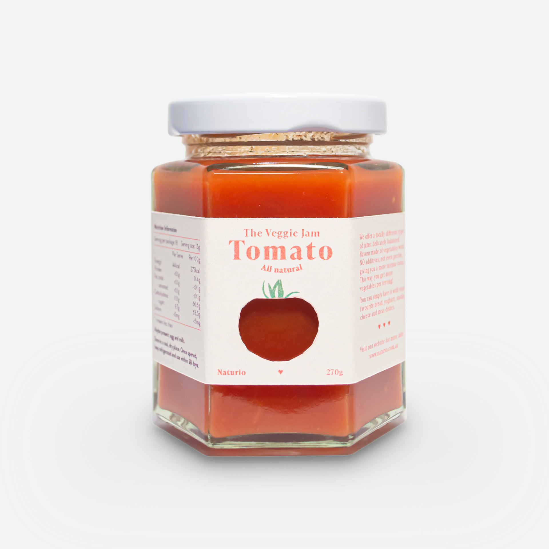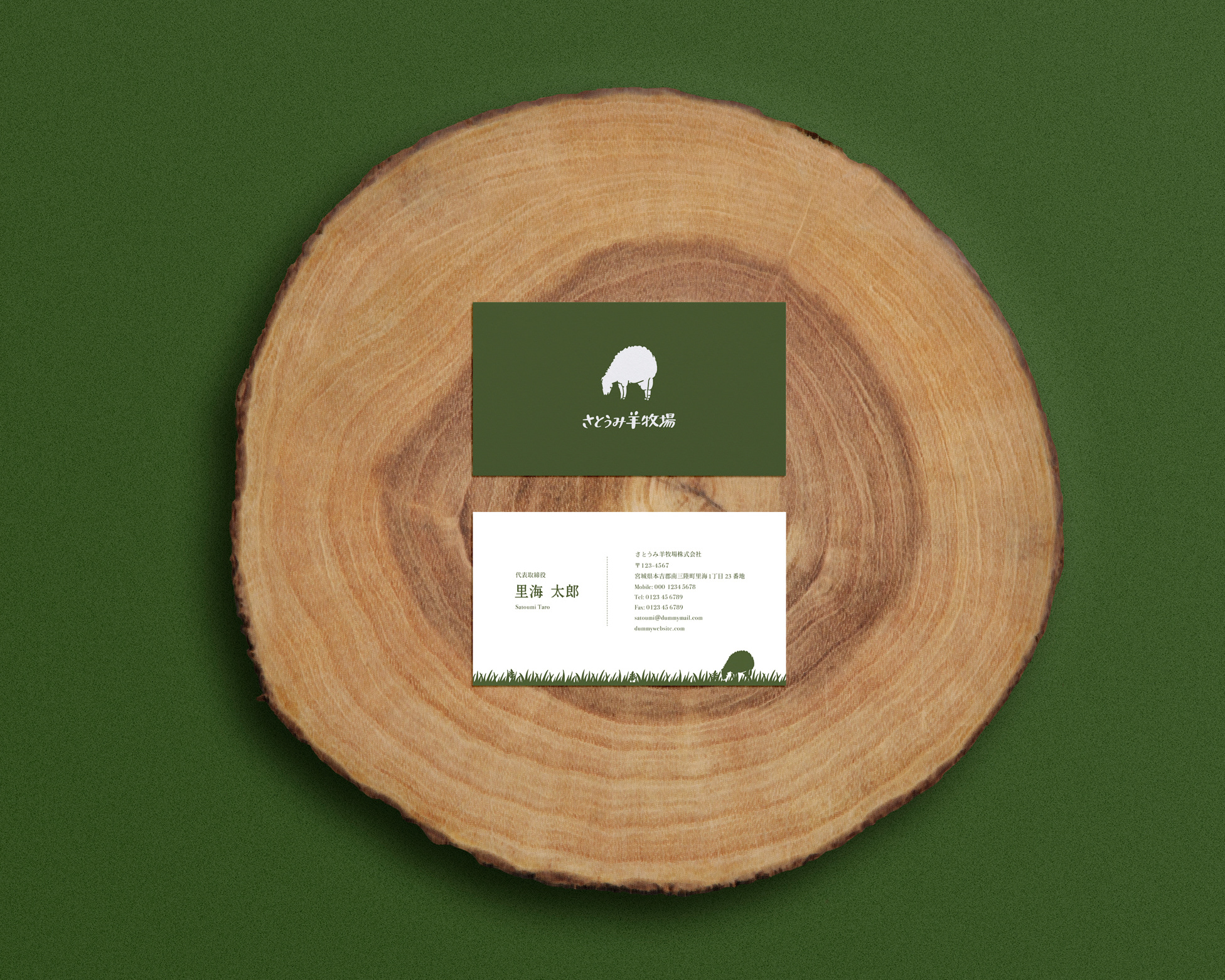

Three cohesive label designs for a healthy jam brand, The Veggie Jam.
The main point of this packaging is the die cutting of vegetable shapes to show the real texture.
Because the layout itself is fairly simple, I've added a bit of twist by applying noise texture to each design as a background to create more organic feel. The small heart on the front and the romance copy section is to represent emotions behind the product that it is not mass produced, rather handcrafted in a small batch.
Because the layout itself is fairly simple, I've added a bit of twist by applying noise texture to each design as a background to create more organic feel. The small heart on the front and the romance copy section is to represent emotions behind the product that it is not mass produced, rather handcrafted in a small batch.
ヘルシーな野菜ジャムブランドThe Veggie Jamのシリーズのラベルデザイン3種です。
このパッケージデザインの一番の特徴は、野菜の形のダイカットから中身のジャムが見えることで、よりリアルにイメージしやすくしているところです。デザイン自体がとてもシンプルなため、背景にノイズのテクスチャを加えてよりナチュラルな雰囲気を出す工夫をしています。正面の小さなハートはこの商品が大量生産品ではなく、人の手で少量生産されていることを表現しています。
Client: Naturio
Classification: Brand identity, packaging, Illustration
Target: Late 20–40’s female
Media: Illustrator