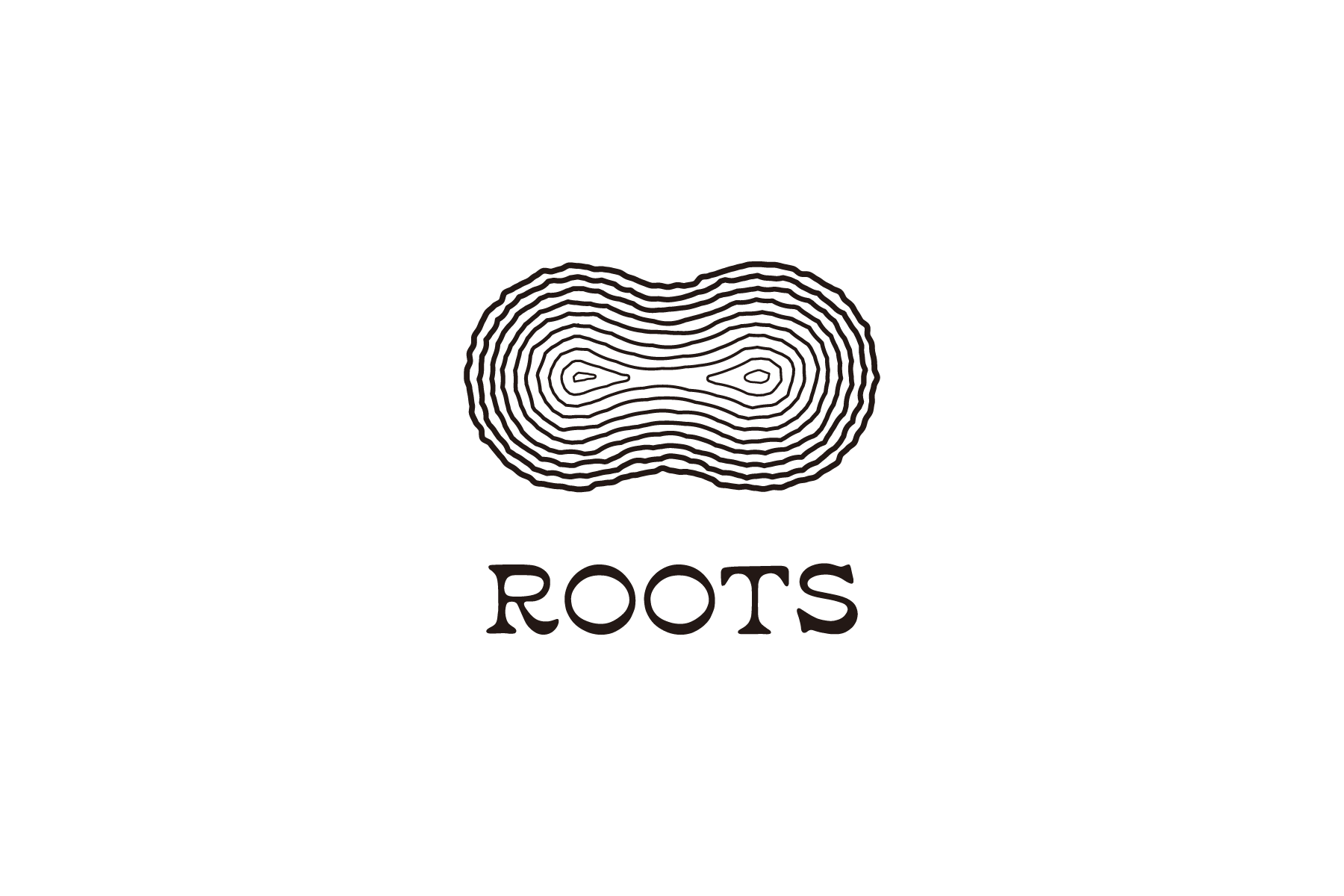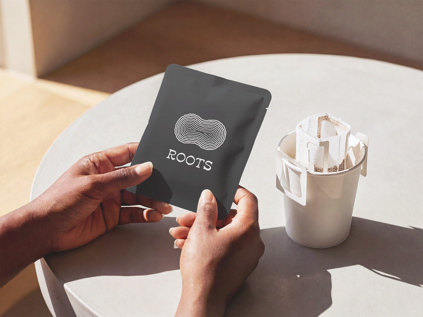
地方の文化や食、人と都市をつなぐカフェバー「ROOTS」のロゴをデザインしました。
シンボルマークは、年輪・等高線・地層を重ね合わせたトリプルミーニングです。
地方と都市の重なりを表すとともに、山や木などの自然、成長、時間の経過と積み重ねを表現しています。
地方と都市の重なりを表すとともに、山や木などの自然、成長、時間の経過と積み重ねを表現しています。
ロゴタイプにはエレガントな印象のセリフ体を採用し、ラフな質感を加えることで、人の温もりや手触りを感じられるデザインに仕上げました。
Logo design for ROOTS, a cafe bar that connects urban audiences with the culture, food and people of regional Japan.
The symbol combines visual references to tree rings, contour lines, and geological strata, representing the connection and layers between regional and urban life. These elements also evoke nature, growth, the passage of time, and accumulation.
For the word mark, I used a serif typeface to create an elegant impression, then added a subtle distressed texture to bring warmth and a more human, tactile quality.
Client: 合同会社リージョンフードパートナー
Classification: Brand identity
Media: Illustrator
Classification: Brand identity
Media: Illustrator